
Although they do not get as much attention as the players who wear them, football shirts are an integral part of the sport. Their sale generates billions of dollars a year, and numerous websites are dedicated to them. A stylish shirt is exalted and remembered for decades. By the same token, an ugly shirt is the subject of endless ridicule. Instead of celebrating the best shirts, this piece will highlight some of the worst football shirts of the last 15 years, similar to how the “Razzies” hand out awards for the worst movies of the year.
Worst Imitation: Club América Third 2020
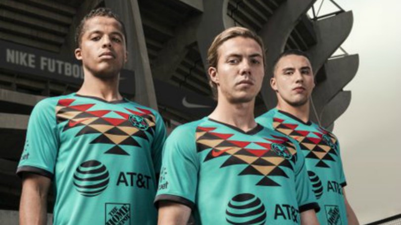
In recent seasons, Nike have treated long-time partner Club América like Mexico’s version of the Oregon Ducks football team by constantly providing Las Águilas with daring designs. América have worn green, white and orange in the last few campaigns, all far cries from their traditional cream yellow and navy blue color scheme.
These releases received mixed reviews, but that did not stop Nike from pushing the envelope yet again for America’s third strip for the Clausura 2020. The multi-colored triangle pattern, running in a V-shape across the chest, is reprised from the 2019-20 home and away shirts. A garish turquoise blue is used as the base color, which, like the triangle pattern, is supposedly inspired by the Aztec Empire. However, the final product looks suspiciously similar to the away kit Adidas crafted for Germany at the 1994 World Cup. Why Nike would choose to copy an unattractive design from their archrival is unclear.
Worst Gradient: Inter Milan Third 2016-17
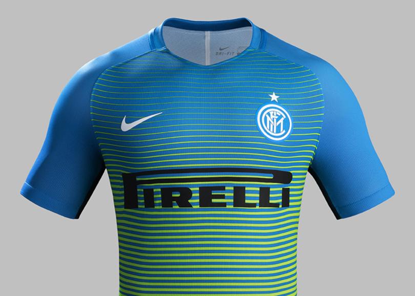
A popular contemporary design feature, color gradients can look terrible if they are not planned with care. Barcelona’s infamous 2012-13 “tequila sunrise” away shirt is often cited as a primary example of gradient gone wrong. However, at least tequila sunrise is a popular drink, and the yellow-red gradient of the shirt is often seen in the sky during sunrise or sunset. On the other hand, Inter Milan’s 2016-17 third shirt, with its light blue-electric green gradient, is inexcusable.
The dubious quality of Inter’s third kit reflected the club’s on-field results in 2016-17. A side boasting the likes of Mauro Icardi and Marcelo Brozović finished a lowly 7th in Serie A, and placed dead last in a Europa League group containing Southampton, Sparta Prague and Hapoel Be’er Sheva. They also went through four different managers, with Roberto Mancini leaving before the season began amidst rumored disagreements with new owners Suning Holdings. However, Inter’s new third shirt may well have been the real reason for Mancini’s departure.
Worst Commemoration: 1860 Munich 150th Anniversary
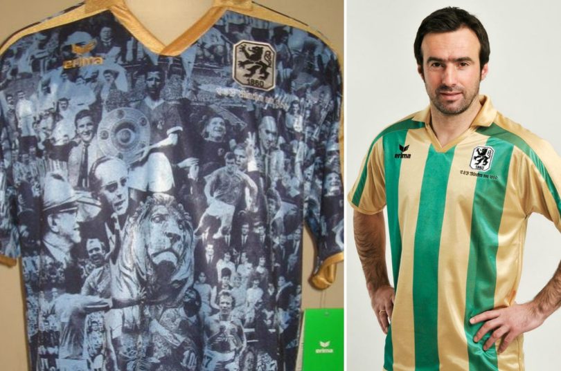
One of German football’s most historic clubs, 1860 Munich was a founding member of the Bundesliga in 1963. They won the league in 1965-66 but have fallen mightily since then, and currently sit in the 3. Liga (third division). In the meantime, city rivals Bayern Munich have lifted a record 28 Bundesliga titles, establishing themselves as one of the most successful clubs in the world.
Instead of making headlines for their play on the field, 1860 are now more famous for their horrendous Oktoberfest commemorative kits, complete with “lederhosen” shorts. Yet, the Oktoberfest designs are pleasing on the eye compared to the shirt 1860 released to celebrate their 150th anniversary in 2010.
The 150th anniversary shirt is quite the bargain: two repulsive kits for the price of one. On one side, a light-blue collage of the club’s most important moments and figures, with gold detailing on the collar and down the arms. Turn the shirt inside-out and you get a green-and-gold striped homage to the club’s original colors. 1860 actually wore the top for a 2. Bundesliga game on March 7, 2010 against St. Pauli, and recorded a 2-1 home win. Hopefully the referee let them wear each strip for a half.
Worst Club-Manufacturer Partnership: Liverpool-Warrior

Started in 1992, Boston-based Warrior was exclusively focused on lacrosse and hockey for the first 20 years of their existence. They broke the mold in January 2012, announcing their foray into soccer with a six-year deal to design the kits for Liverpool. At the time, Warrior general manager Richard Wright said, “we are here to shake up the world of football”. A delusional, novice manufacturer pairing with one of soccer’s most storied clubs: What could possibly go wrong?
The partnership was a disaster from start to finish. Warrior produced five kits within a three-year span that are worthy of ridicule, with the 2012-13 third shirt, 2013-14 away shirt, and 2013-14 third shirt particularly heinous. Warrior’s performance was so shoddy that parent company New Balance took over production midway through the six-year deal. Since then, Warrior has stuck to making hockey and lacrosse equipment. Even if they wanted to get back into soccer, it is unlikely that any club would let them make their kits.
Worst Camouflage: Chelsea Away 2007-08

Until Warrior’s fateful partnership with Liverpool, the alliance between Adidas and Chelsea was the worst in world football. Despite being recognized as one of soccer’s premier kit manufacturers along with Nike, Adidas routinely produced awful strips for the Blues. The 2008-09 third shirt looks like a cheap imitation of a BATE Borisov home jersey. The 2011-12 away shirt has what is best described as a light-blue keyboard covering the chest.
However, neither compares to the hideous 2007-08 away shirt. Anyone who attended a Chelsea road game that season risked going blind from the garish electric yellow color John Terry and company sported. Furthermore, the black inserts starting below the collarbone and running down the sides of the shirt are crowded out by the obligatory Adidas three stripes (also black) on the arms. Even though their contract with Adidas expired at the end of the 2022-23 season, Chelsea bought themselves out of the deal in May 2016. It only takes one looks at the West London club’s 2007-08 away kit to understand why.
Worst Cuisine: Bedale AFC Away 2017-20
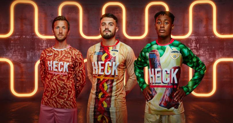
As is the case with other kit design gimmicks, lower-division Spanish clubs have taken the lead in putting food on their shirts. La Hoya Lorca put heads of broccoli all over their 2013-14 away kit, while CD Lugo had an octopus tentacle draped across a shirt they wore during the 2014-15 preseason. CD Guijuelo’s 2015-16 away shirt was even tastier, with slices of the town’s famous jamón ibérico covering the top.
Yet, none of these Spanish clubs dared to put food on their kits more than once. Northern English amateur side Bedale AFC, on the other hand, were crazy enough to make sausage-inspired away shirts for the last three seasons. The 2018-19 vintage, which has a ketchup and mustard-covered hot dog in the center of the shirt and shorts surrounded by a bun, is the worst of a terror-inducing trio. After the release of the 2019-20 “sausage and mash” away strip, club chairman Martin Coombs told the BBC “if this one is named the worst kit then that’s it, it’ll be our last one”. As a favor to human kind, this writer names the Bedale 2019-20 away strip worst kit.
Worst Formal Attire: Cultural Leonesa
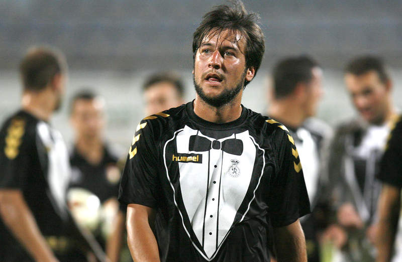
A respected shirt manufacturer, Danish brand Hummel expanded into formal wear with the special kit they designed for Spanish minnows Cultural Leonesa before the 2014-15 season. “La Cultu” only wore the shirt, which resembles a black smoking jacket with a white shirt and black bowtie, for preseason friendlies with Sporting de Gijón and SD Ponferradina, but the tiny club from northern Spain became an international sensation nonetheless.
Buoyed by the attention, Hummel designed another “smoking jacket” shirt for the León-based club in December 2015. This time, a long-sleeved white jacket was paired with a black shirt and white bowtie. The release made headlines across the globe, and 10% of all funds raised from sales of the shirt went to Save the Dream, a nonprofit dedicated to using the “power of sport to build more fair and inclusive societies”. Even though the shirt is hideous, Hummel deserves plaudits for their philanthropy.
Worst Anatomy: CD Palencia
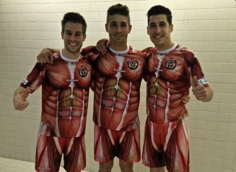
In May 2016, amateur club CD Palencia faced a crunch playoff for promotion to Spain’s Segunda División B (third division). Looking to gain an advantage, Palencia and manufacturer Kappa released a new shirt so grotesque that any opposing team would faint upon first viewing.
The shirt is a depiction of the human muscle anatomy, including the obligatory chiseled six-pack. The slogan used to accompany the release, “#Nosdejamoslapiel”, translates to “we leave the skin”. Palencia managed promotion that season, but unfortunately disappeared in 2019. Fans of the human musculoskeletal system everywhere were surely left in tears at the news.
